
UrbanLens
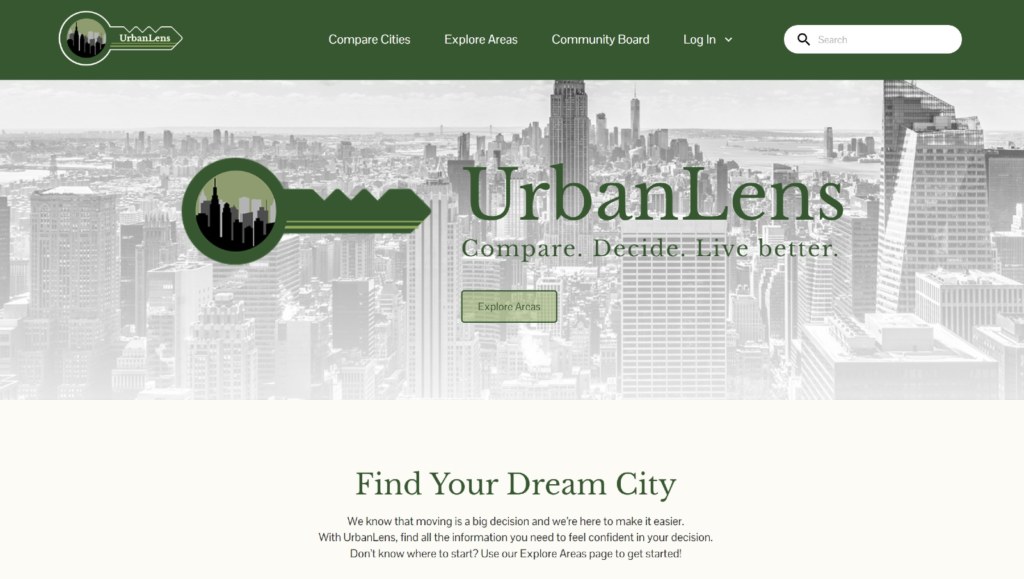
UrbanLens is a website that helps users explore and compare U.S. cities based on real cost data and community input.
Overview
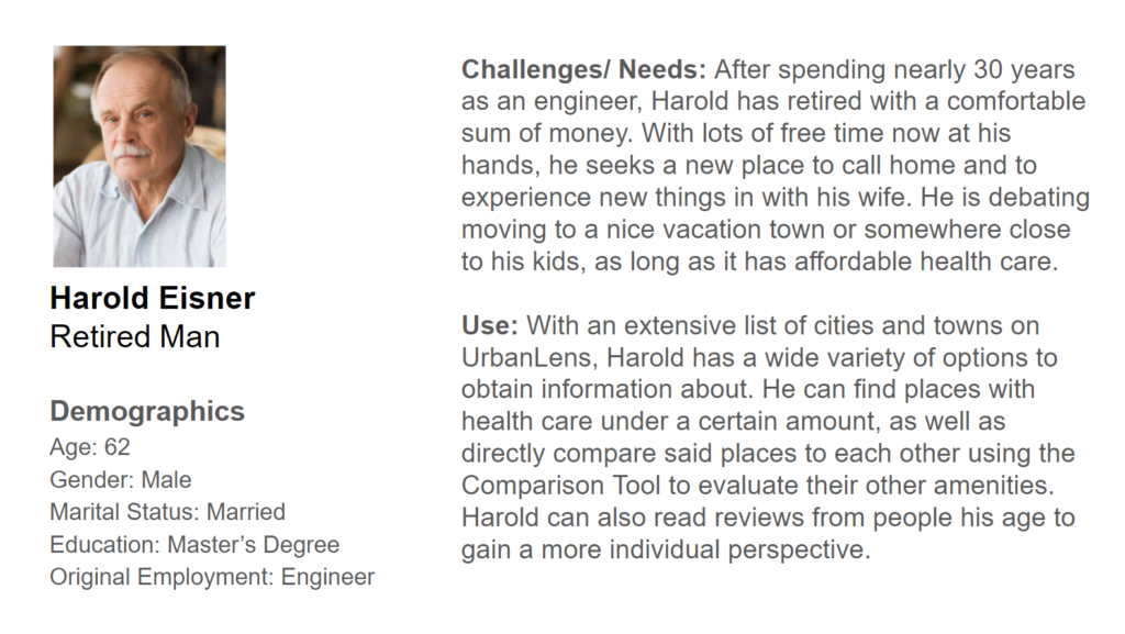
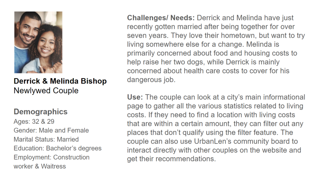
UrbanLens helps people make informed decisions about where to live. It accumulates data for various cities like the costs of housing, food, transportation, and healthcare, as well as personal anecdotes from residents who know a location firsthand.
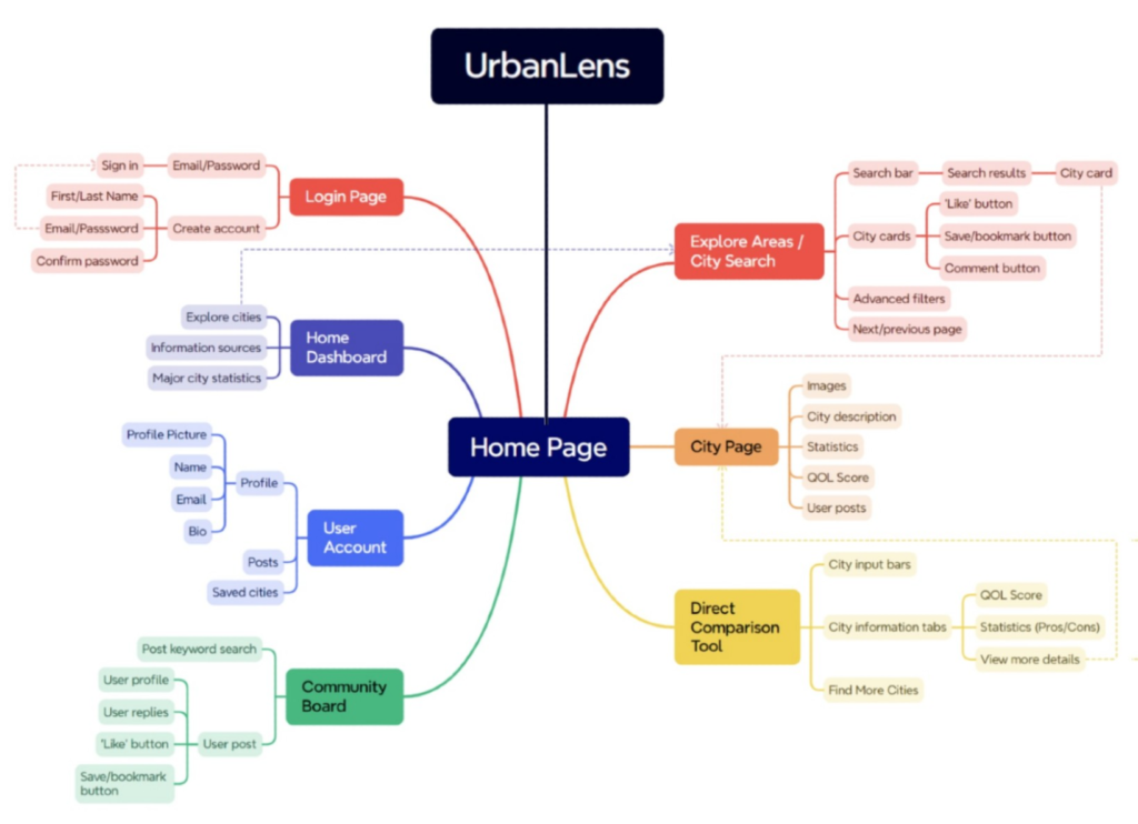
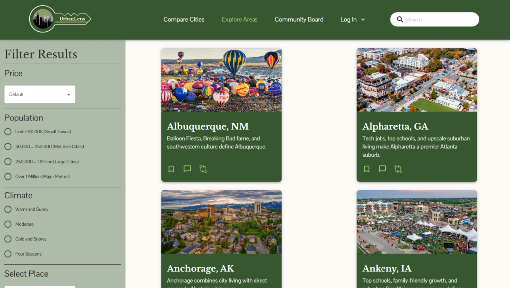
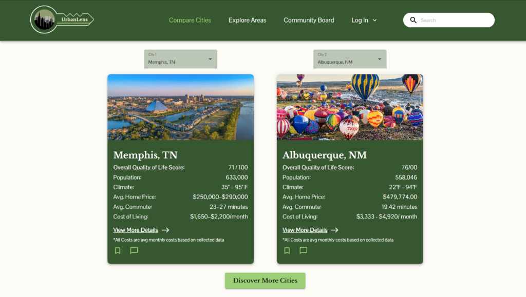
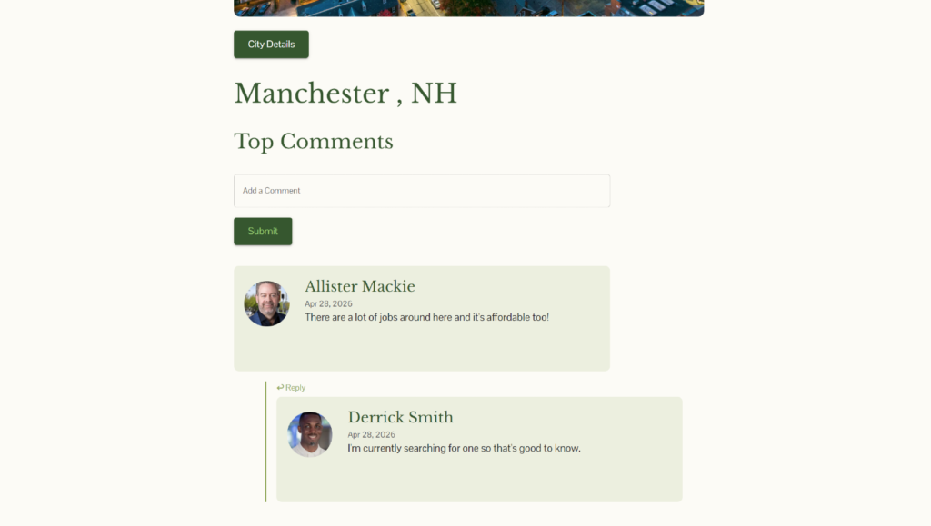
Users can filter cities by certain statistics and compare locations side by side with pros and cons for each. Users can create an account to bookmark cities for later viewing, as well as ask questions and share their experiences on the community board.
UrbanLens was selected for the UCF Digital Media End of Year Showcase, where our team presented it to the public, as well as to industry professionals.
My Role
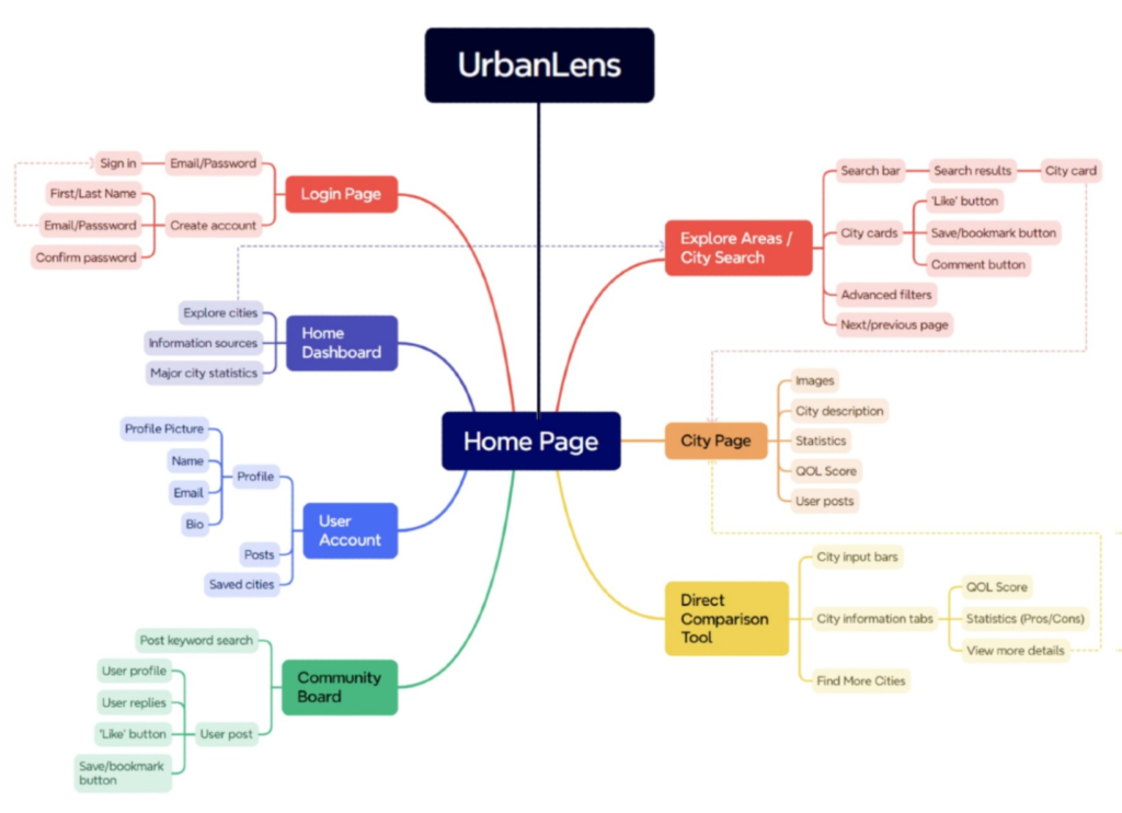
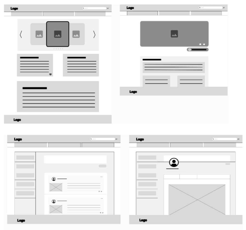
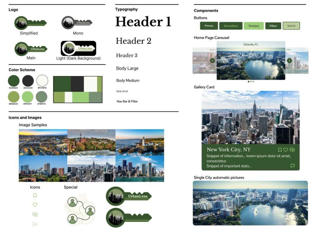
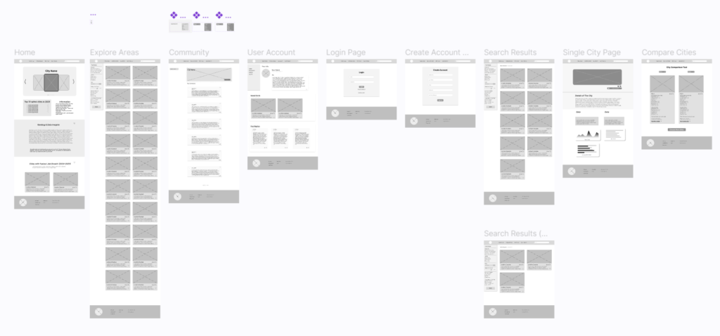
UrbanLens was a team project, and I played my part in many aspects of it, from early planning to visual design. As the lead researcher, I headed the accumulation of data that the whole platform is built on, compiling each city’s population, climate, and living costs across housing, food, transportation, and healthcare. I helped structure the site’s information architecture and developed use cases for how different audiences would find UrbanLens useful. I also contributed to the project’s visual identity, shaping decisions around the logo, color scheme, and typography, and helped design several pages in our final Figma prototype.
The login screen in particular is something that I designed myself. I made it from scratch with no existing layout to build from. I kept the look and feel of it close to what’s expected from a modern login screen, while still giving it its own identity to fit with the rest of the website. The frosted, blurred background behind the input box is the part I’m particularly proud of. I had to determine the exact color and blur amount so the username and password fields and the buttons look as if they are sitting on top of the box, while also looking transparent enough to let the background show through. It was a small thing, but the team noticed it, and getting that balance right is exactly the kind of detail I care about.
Process

Designing the Login Page
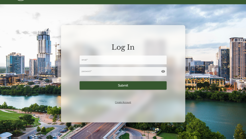
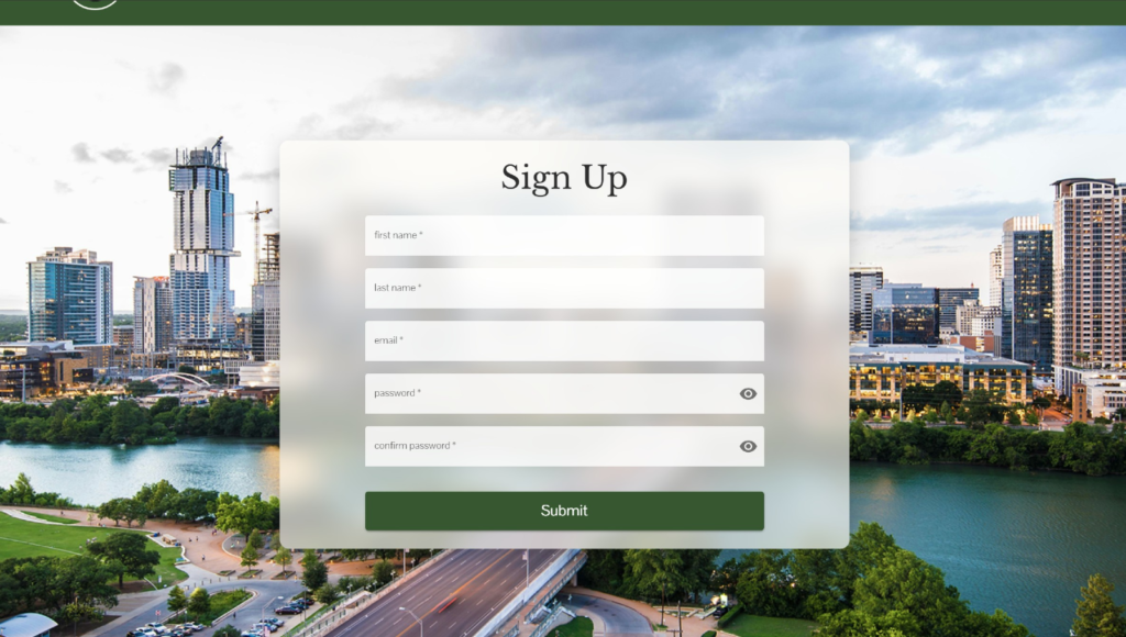
The login screen in particular is something that I designed myself. I made it from scratch with no existing layout to build from. I kept the look and feel of it close to what’s expected from a modern login screen, while still giving it its own identity to fit with the rest of the website. The frosted, blurred background behind the input box is the part I’m particularly proud of. I had to determine the exact color and blur amount so the username and password fields and the buttons look as if they are sitting on top of the box, while also looking transparent enough to let the background show through. It was a small thing, but the team noticed it, and getting that balance right is exactly the kind of detail I care about.
Outcome
The final result is a fully functional website where users can browse cities, compare them side by side, and contribute their own insights.
Reflection
Presenting UrbanLens at the Digital Media Showcase was my first real exposure to the wider web design community, and one of the first times I’d shown something I built to people in that setting. Most of my earlier work was personal projects or assignments made for a grade. This was something greater, and I’m glad I was part of it.